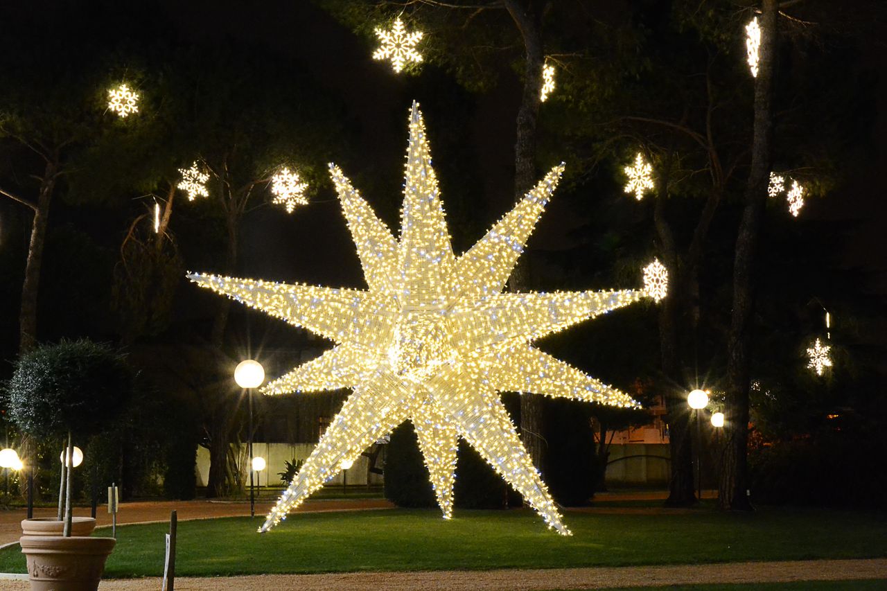
Large light displays can be a daunting feat to tackle. Hence, this month’s newsletter is a simple, jargon-free guide to making holiday displays look cohesive. It walks through five easy design habits that municipalities, BIDs and Main Street organizations can apply to pole wraps, bows, banners, overheads and more.
1. Pick three colors
Designers have a handy starting point called the 60-30-10 rule. One dominant color covers about 60% of the space, a secondary color covers about 30% and an accent covers about 10%. House Beautiful
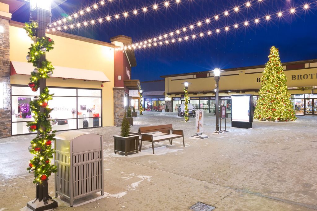
On a streetscape, that might look like evergreen garland doing the heavy lifting, a cream or gold ribbon in support, and a pop of red in the bows. (Just an example! Your colors, your call.)
This starting point helps reduce the mental gymnastics of continuity across miles of possibility. Although, the formula is solely a guideline for balance across space; rules always have their leeway. For example, this can be broken down by splitting the accent (or the 10%) into two smaller ones. The goal is balance rather than restriction. cwcreative
2. Repeat yourself
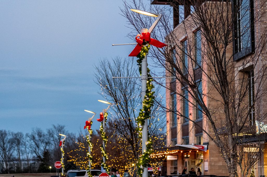
Repetition gets a bad rap, but in design it’s the secret sauce. Repeating design elements creates unity. Use the same bow style, the same garland texture, the same ribbon, block after block, and people’s brains quietly register “oh, these are the new decorations our town put in, how festive!” getty
3. Pick a star
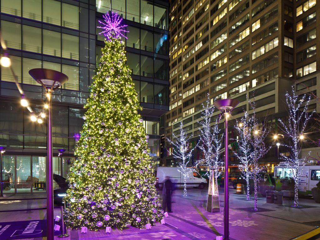
Emphasis is the part of a design that grabs attention, usually by contrasting with everything around it in size, color, or texture. Getty
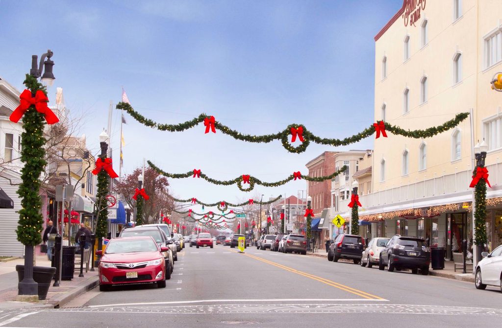
Say the corner plaza gets a big lit tree wrapped in warm white. That’s your headliner. Everything else on the block can take its color cue from it and stay a few notches quieter, so people’s eyes land on the tree first and the rest of the street feels like it’s part of the show.
If the star is a giant ornament display or a topiary figure at the entrance to downtown, it works the same way, greeting people the moment they arrive.
So decide who the headliner is. Then overheads can be the supporting act, and pole wraps and bows can be the backup singers. When everything is trying to be the star, the eye doesn’t know where to land.
One fun wrinkle: things mounted high look smaller than they really are, so what feels big on the ground can feel modest up on a pole.
4. Find your beat
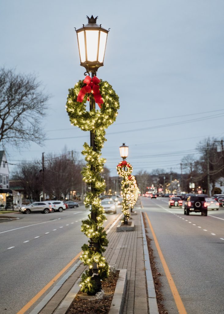
Think of your display like a playlist (I know, a lot of music references). But rhythm comes from repeating elements, creating a feeling of organized movement much like music. Every pole? Every other pole? Little clusters at corners and gateways? Any of those works, as long as you pick one and keep it going.
And then add a twist. Variety is what keeps rhythm interesting. Banners on every pole along Main Street, all in the same two colors, with a different message on each, “Shop Local,” “Season’s Greetings,” “Cocoa Weekend,” “Tree Lighting 12/5.” The colors set the rhythm, and the messages keep walkers curious about what’s on the next pole. getty
5. Take the dusk test
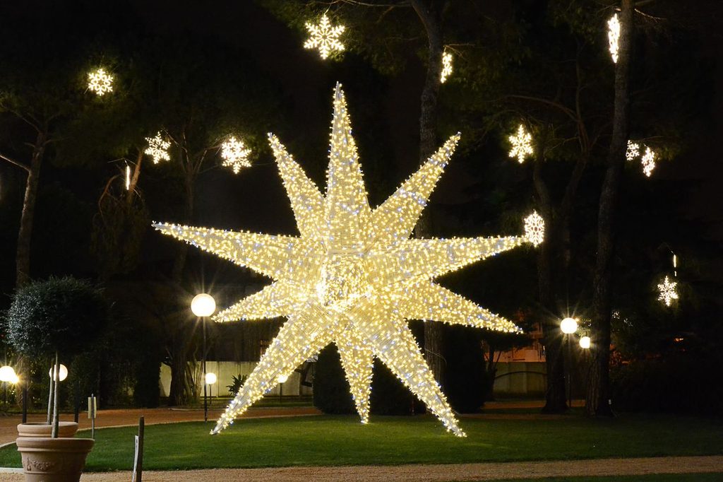
Before you call it done, walk it at the end of the day, then drive it with the windows up. It’s the best (and cheapest) design review out there, and it shows what a daytime walk never will: how the whole thing actually reads from a distance and in the dark.
Your pocket checklist
- What are my three colors?
- What’s the one thing I’ll repeat everywhere?
- Who’s the star?
- What’s my beat?
- How does it look at dusk?
You don’t have to do it all at once
A cohesive downtown is almost never built in a single season. Start with a clean set of pole wraps and bows done consistently, then add banners, overheads, or a showstopper later. Each piece you add just needs to follow the story you’ve already started.
Curious how this could look on your streets? We’d love to talk it through. Contact us here and let’s get started.